
Twitter is rolling out a new look for people’s profile page. The main complaint I saw in my twitter feed was it looks way too much like Facebook. True enough. Rather than copying Facebook’s old school website, I think twitter might be better served copying Facebook’s conglomerate approach. In particular by creating a second app for casual users along the lines of Facebook Paper.
Before we get to that, let’s take a look at my @praxtime page, from the twitter account I use to publish posts for this site. It still has the old design. At least when I grabbed this shot.

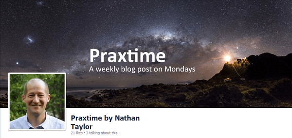
Next look at my Praxtime Facebook page.
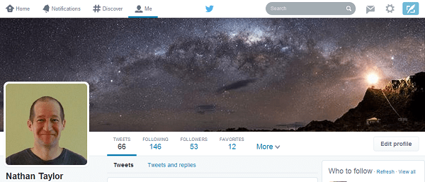
Finally, see my personal twitter account @ntaylor963 below. You may note I’m in a casual t-shirt for my personal account. While my profile pic on Praxtime looks a bit more respectable, what with the collared shirt and all. Anyway. The point here is my personal account has already been upgraded to the new twitter look. And no surprise, it does indeed look like Facebook. You can read more about “Twitter Cribbing From Facebook” from a feature point of view here.
Why mimic Facebook? Growth. Or rather a slowdown in growth. Brought on by Twitter’s difficulty in pulling in casual users. I wrote about this last year in my post Area man reports “I’m in a promising local blog.” Which is why Twitter needs Pandora style timelines.
From that post:
New twitter users face two big hurdles. First, overcoming the mental hurdle of understanding the following/follower model. In the jargon, onboarding and discovery. Second, editing and keeping the list of people you follow up to date (that’s curation). The equivalent of curation for music is people who edit and tag all their mp3′s, and keep playlists and favorite artists up to date. For music nerds like me this curation is worth it. For normal human beings, honestly it’s not.
But curation has another problem. Local bands want to be stars. You send out a great tweet. Your hit single. No one cares. Not only is curation too much work for normal human beings, it has a hidden emotional cost. Curating your list makes you depressed. Twitter works by giving you a direct connection with stars. But if you aspire to stardom yourself that emotional connection backfires.
What should twitter do? Perhaps there isn’t a solution. Twitter continues on its path of being an utterly dominant platform for the 1 percenters in all walks of life. Not a bad business to be in. But I have a proposal. Twitter should extend its existing Discover feature to make it a Pandora style timeline feed.
Back when I wrote that, I was thinking a single website and app could cater to both regular users and 1 percenters (power users). A classic and extremely difficult design problem. But now believe a better approach would be to create a second and entirely new twitter app, perhaps tied to a new website. One catering directly to regular (non-power) users. Facebook created a second app with Facebook Paper. The New York Times did it with NYT Now. Why not create a new twitter app focused on casual users? For discussion let’s call it “Twitter Now”.
Here’s how “Twitter Now” might differ from traditional Twitter:
- Focus on casual users. Just choose a couple of topics of interest to get started (like Flipboard launches the first time for example).
- Remove the need to curate your “following” list. That’s too complicated and depressing for regular people to fuss over. Even though it’s essential for power users.
- Instead, use Pandora style like/dislike on individual tweets to curate your feed. This downplays or perhaps even hides the follower/following model, though the app would still use it under the hood. Twitter has some of the deepest and most timely information available on what people are interested in. They just need to serve that info up differently for different types of users.
- Focus on breaking news, trends. So turn the “Discover” tab into the primary feed. I think traditional power users will mock this as “Tabloid Twitter.” But you know, haters gonna hate.
- More photos and Facebook/Instagram style features, such as tagging people, which came out as part of this new design. Photos are great for casual use, but are often clutter for power users. Though I do love it when pros like Benedict Evens or Horace Dediu drop a good chart.
- Ensure the same Twitter account works on Twitter Now and old school Twitter. So if someone wants to graduate into being a power user they just log into the traditional app and everything comes across. In fact it’s quite possible many people would regularly use both apps, depending on the job at hand. I would love having a Twitter Now style app in fact, even though I’m a power user and keep a highly curated following list.
Of course ideas like this are cheap. Creating and shipping a scalable app people love is hard. Undoubtedly Twitter’s leadership has already considered this and many other options besides. And to be clear, some of the recent changes to Twitter are long overdue. I actually kind of like the new profile page. My real issue is list curation has been and always will be a power feature. Keeping lists of your email addresses, bookmark lists and music playlists up to date is a pain. Most people don’t bother or do it at best halfheartedly. It’s a problem even for Facebook, which at least has the advantage that its social graph starts with people you know in real life. Twitter’s dilemma is its amazing power is built on discovering people you share interests with but for the most part don’t know. And the downsides of the second app approach are clear. A second app would dilute Twitter’s brand, confuse people, make it harder to keep focus, and even nudge Twitter towards being a social conglomerate. Perhaps that’s why Twitter’s leadership hasn’t gone down that path. But catering to regular users and power users within the same app is also pretty bad. If they keep going, Twitter may create a Facebook/Twitter hybrid that alienates power users without bringing casual users on board. Avoiding that possibility with a Twitter Now approach seems preferable.
___________________
Footnotes:
- Benedict Evans has an older but still topical piece on “Twitter as a blank canvas,” which helped clarify my thinking on what the problem is. My solution the blank canvas problem is of course a dedicated app for casual use.
- Ben Thompson also has a still topical piece from September of last year “There Are Two Twitters: Only One Is Worth Investing In.” Thompson argues twitter #1 which provides info on trending topics is worth far less than twitter #2 which provides customized world class info on whatever you’re interested in. Thompson’s twitter #1 is somewhat aligned to my idea of Twitter Now. Though I’m approaching this from a product usability rather than revenue model point of view. Hence my primary point about list curation being a showstopper for mainstream casual use. Despite it’s incredible value. But thinking about this more, it’s possible a Twitter Now approach would not just unlock casual use, but also provide an opportunity for revenue models targeted to that use. So Twitter #1 could have different kinds of advertising, music/movie tie ins, stickers, and what have you compared to twitter #2.

I agree with your original content.
I know that investigative agencies already use Twitter for breaking news, so these type of Twitter analytics already exist, even if like Google secretly is, are mostly mechnical Turks. Although I saw a rough attempt at such analytics linked on HN, without awareness of existing efforts.
Also, agree in practice. My Twitter following list I find useless to browse, it’s more like a blogroll, since some frequent posters scroll all the other content off the screen. So I do what I once read most people on Facebook do, instead of using the massaged feed which is just click on people’s pages that you want to read, now and then.
In “Le Show” voice: “here it is!”:
http://blog.gnip.com/
HN: Gnip provides data normalization of tweets.
There’s no reason to do that unless you’re doing analysis.